
This post is part of Exploring a Culture of Health, a citizen science series brought to you by Discover Magazine, SciStarter and the Robert Wood Johnson Foundation, serving as an ally to help Americans work together to build a national Culture of Health that enables everyone to lead healthier lives now and for generations to come.
There is a seemingly endless stream of health data. Visit the doctor and you get a report listing various bits of data such as your weight, blood pressure, cholesterol and blood sugar. Listen to the news and you hear statistics on risk factors, medication side effects or mortality rates. All potentially useful information, but without background or context, the numbers are likely confusing, meaningless and eventually forgotten. “For health data to be meaningful, the person needs to see themselves in that data. To make this happen, we need to understand how to present data so that it conveys a complete message, not just a number,” says Andrea Ducas, program officer at the Robert Wood Johnson Foundation (RWJF).
A team of scientists from the University of Michigan team set out to solve this problem, creating Visualizing Health, with support from RWJF, to explore ways to visualize health data. When designed well, visuals can be powerful tools for conveying information. “What we lack is data on how best to present data,” says Thomas Goetz, former RWJF Entrepreneur-in-Residence and collaborator on Visualizing Health.
 To test how best to visualize health data, the Michigan team created a list of 16 common risk communication problems – scenarios in which an individual would need to understand
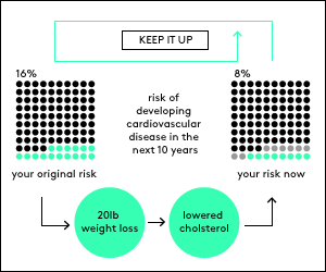
health-related information to assess a particular risk. Example scenarios include assessing tradeoffs between different medications or treatment options, or relating personal biomarkers such as cholesterol levels to various health risks. The team presented the list to graphic designers who purposefully did not have a background in health communication. “We wanted them to think outside the box,” says Ducas. The graphic designers created multiple images for each scenario, each one addressing the problem of risk communication in a different way. Finally, each visualization was tested and compared with the others for clarity through surveys with everyday consumers and citizens.
“The main takeaway from the study is that there is no one way to present data. It really depends on your communication goal,” explains Dr. Brian Zikmund-Fisher, assistant professor of Health Behavior and Health Education and the lead researcher of the University of Michigan team. “While the visualization needs to represent the data truthfully, it also needs to be purpose-driven. But one should also be aware that changing how the data is presented can drastically change its message. Depending on how the data is formatted, the same number can increase alarm or allay fears. It is a critical consideration, and as communicators, we have a responsibility to take ownership of how we present data.”
Visualizing Health’s website provides a gallery of all the images tested and a relative ranking of how each fared in comprehension and clarity scores. “The gallery has a wizard that guides the visitor through the gallery and reinforces the point of identifying one’s communication goals,” explains Zikmund-Fisher. “By asking a few questions upfront — like ‘are you communicating a specific fact or a relative relationship?’ — it helps the visitor clarify his or her purpose. Then the wizard provides a collection of images. This allows the visitor to compare and contrast the impact of subtle design differences and illustrates that there are different ways to achieve the same goal.” To make it easier for end users to understand how to use the site, the team even created a comic illustrating two real-world scenarios in which an educator uses Visualizing Health.
All the images are licensed under Creative Commons, meaning they are free to download, reproduce and adapt. “We want the project and its website to be a platform to spur discussion on how researchers and the design community can collaborate on health communication,” says Ducas. “We want health educators, journalists, and anyone in the position of communicating health data to be able to use and learn from the project. And we are already thinking about how the website can be used to create customizable images.”
A secondary goal of this project was to create a model for “lean science,” continues Ducas. “We purposefully conducted our surveys through online tools, which are relatively affordable and accessible, showing you don’t need a huge budget to conduct well-crafted research. This type of lean science promotes more democratized access to research by lowering barriers and increasing inclusiveness.” The complete report of the project’s study, including the team’s methodology, is available here.
This project is just the beginning of the research that can be done. Zikmund-Fisher sees lots of opportunities for individuals to help test and gather data about data visualization and communication. “Say a journalist is writing about cancer risks and wanted to include a risk chart. Instead of creating one chart, create two charts and test which one communicates the data better. The difference might be small, but we could still learn a lot. Instead of guessing that we are successful in communication, let’s gather the data to show it and learn from it.”
Visualizing Health is designed to greatly benefit from your input. What design ideas do you have? What data gathering techniques can you think of? Visit the project and tell us in the comments below what recommendations you have for making Visualizing Health a more valuable resource for designers and health care providers.
****
Interested in contributing to health-related citizen science projects? Here are other ways to help researchers generate and visualize health related data:
GoViral is a project run through the Harvard Medical School and Boston Children’s Hospital which generates real-time data on flu infections and symptoms within a geographical area. Participants report symptoms using a mobile app or through their website. Check out their map to see the status of flu symptoms in the Boston area.
The Kinsey Reporter is a project exploring how to generate behavioral data while protecting user identities. Using a mobile-based survey, the project gathers and visualizes anonymous data about sexual behaviors and sexual practices around the world. The collected data is accessible online and downloadable for offline analysis.
Both GoViral and Kinsey Reporter are part of a database of more than 800 citizen science projects created and managed by SciStarter, an online citizen science hotspot.
![]()